
The most important web design trends of 2016
What web design trends can we expect in 2016?
What is passé and what is en vogue?
Functionality has prevailed against the background of the increasing use of mobile devices, but design trends are constantly evolving. The trends that await us in the coming year leave nothing to be desired. If you haven't updated the look of your website in the last five years, now is the time to take action. Otherwise, you risk falling behind your competitors.
Web design is currently in a phase of rapid development. In the past two years we have witnessed the emergence of such important trends as scrolling, responsive design and storytelling. But what can we expect in the near future? I predict that we will see more and more truly unique and well thought out websites. In this post, I want to show you a few ideas on how you can bring your website closer to this current trend.
Responsive web design
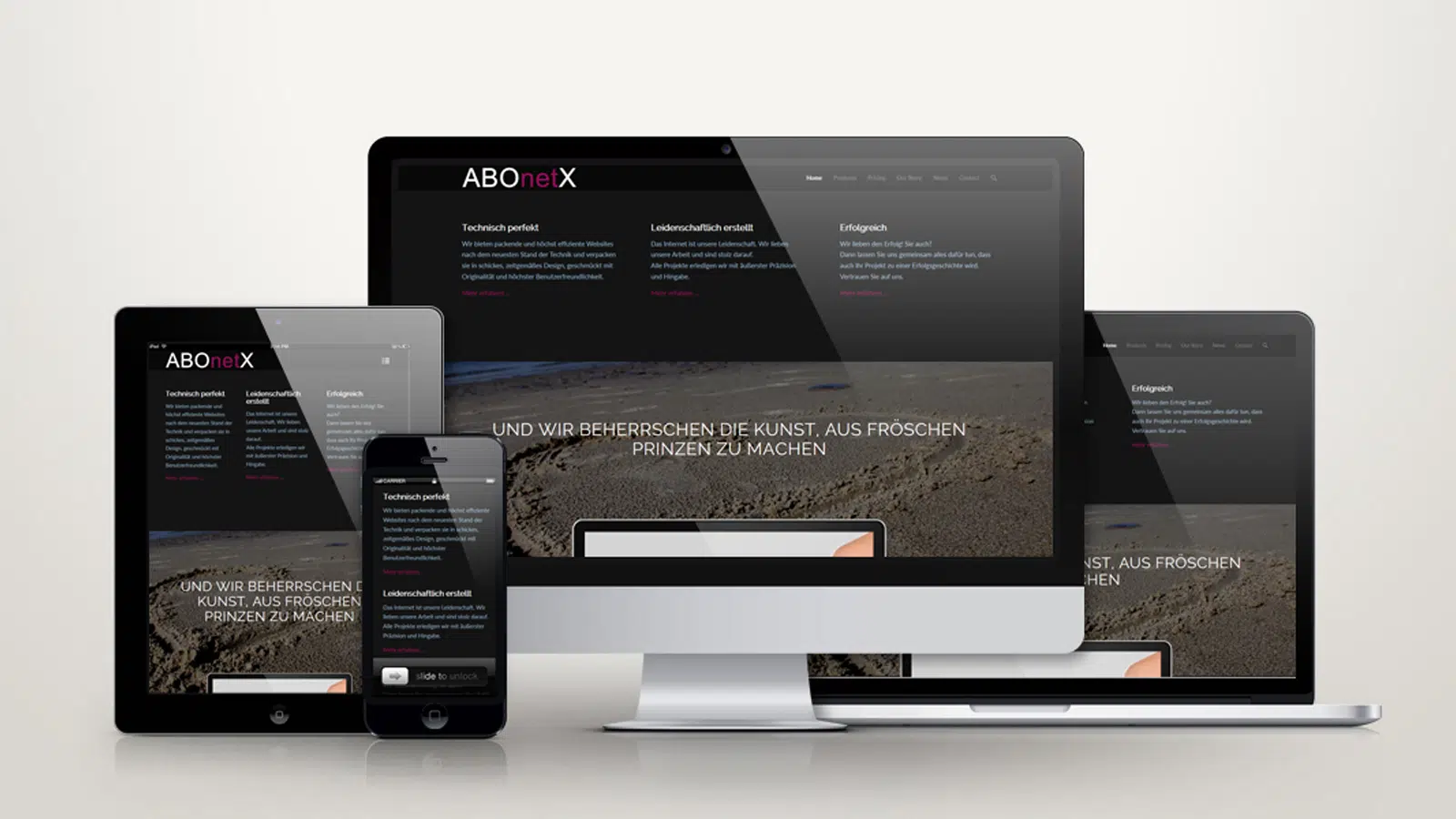
This is no longer just a trend, but rather a kind of industry standard. It is not without good reason that experts are already predicting that mobile devices will generate more traffic on the web than desktop devices in the near future.
For this reason, web designers and website owners alike are forced to give this aspect due attention if they do not want to lose touch with the new mobile generation of Internet users.
Good programming and responsive design skills are required for complex page structures.
You can find more about this topic in our article Responsive Design.
Single Page Design
Single page websites, also known as "one pagers", are websites that display all content on a single page and where the user scrolls from the top to the bottom. This design concept is the answer to the user's need for information that is prepared in a structured way and concentrated on the essentials. It remains popular for several reasons:
Scrolling is intuitive, provides an interactive experience with the website, and significantly improves the user experience.
In addition, such one-pager stories can be made very lively. They're great for that "Tell stories" (Storytelling).
In this way z. B. present the history of a product very impressively. One-pagers allow designers to think more in stages and chapters than pages and grids. The interplay of text, graphics and animation creates a very special reading experience for the user.
Storytelling
You can find more about this topic in our article Once upon a time – tell your story.
Emotions and stories govern successful marketing, because a good story makes a company, a product or a brand tangible. Being entertained is one of the most powerful human emotional needs.
The aim of storytelling is to captivate the visitor to a website with an exciting story about a brand, product or service in order to get them to identify with this brand, product or service.
In this way, very lively websites with exciting user guidance can be created. But well-done storytelling on a website can be a complex undertaking, which is then associated with a corresponding amount of effort.
If, however, it is possible to reach the user emotionally with a symbiosis of text, image, video and sound and to take him on a fantastic journey into fascinating worlds and stories - interactively guided - then identification with the offers is strengthened in such a way that they like it discussed, taken up again and again and shared on social networks, because good stories spread by themselves.
Ghost Buttons
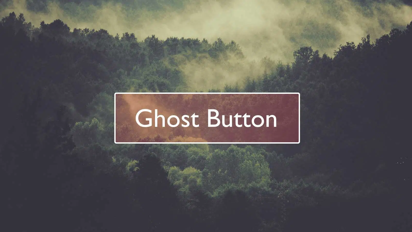
The term Ghost Button stands for a design concept in which buttons are reduced to a minimum. The actual ghost button consists only of a mostly thin frame and the text within it. A button can hardly be more minimalistictalten – assuming you should also be able to recognize it as a button. Reduced in this way, he is practically just a shadow of himself, i.e. a ghost.
Ghost button doesn't sound very exciting, but it can look really chic, because it comes across as elegant and delicate and has become very popular because of it. Because of this, these buttons are sure to be with us for a while – especially on sites with distinctive typography, bold colors, and background videos.
Cardlayout
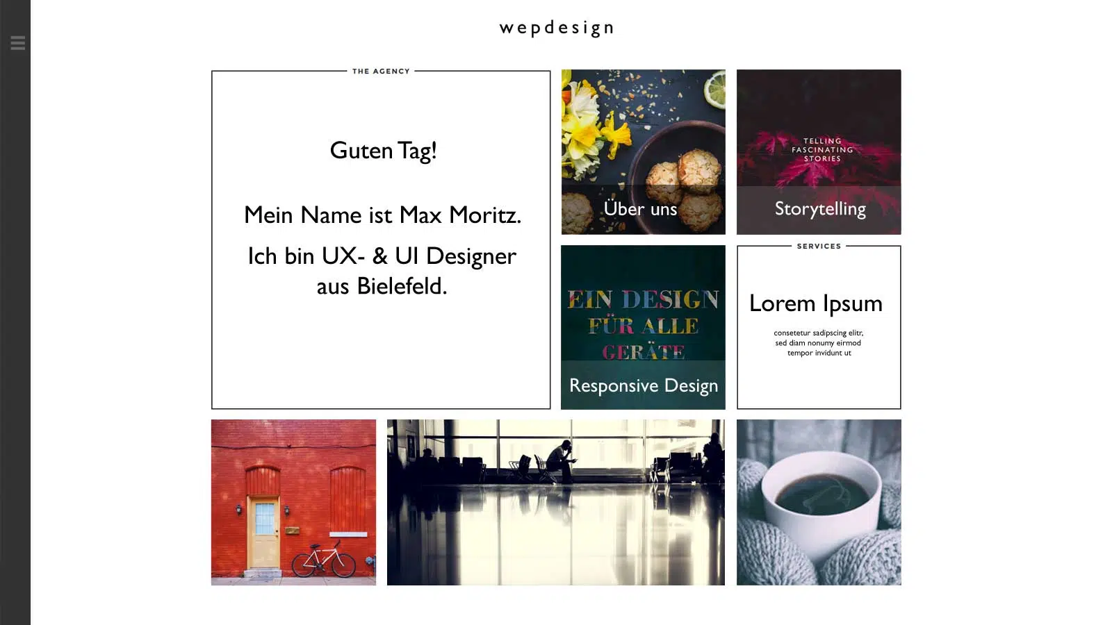
It is understood as the division of a website into different, easily distinguishable "cards" in the form of squares and rectangles, which essentially contain short text messages, an image or a "Call To Action" button (CTA = request for action to the user). Not only does this design look good, but it's also "finger-friendly", allowing for quick and easy navigation on both desktop and touch devices.
Functional typography
With the further development of Responsive Webdesigns and the concentration of web designers on optimized usability, especially on mobile devices, the choice of the right typeface has become more and more the focus of the web designer community. The font size also plays an important role here and the trend is clearly towards generous body text and huge headlines.
But large typefaces are not only pleasant to read, they can also have a creative and artistic character if used correctly.
And because today, for example, Google Fonts or Typekit offers a large selection of beautiful and individual fonts, some of which are also available free of charge, typography can now be used more than ever as an important style element in web design.
Have we piqued your interest?
Then contact us. We would be happy to advise you without obligation.