Responsive Webdesign
What is that, actually?
Almost every new customer these days wants a mobile version of their website. The sizes and resolutions of the displays on laptops, desktop PCs, tablets, smartphones, e-book readers and televisions vary greatly and more and more people are turning to mobile devices when surfing the Internet because technology is constantly evolving and the range of internet-enabled devices available on the market is constantly expanding.
What is meant by the term Responsive Web Design?
The term Responsive Web Design was first used by Ethan Marcotte in a post in A List Apart magazine in May 2010.
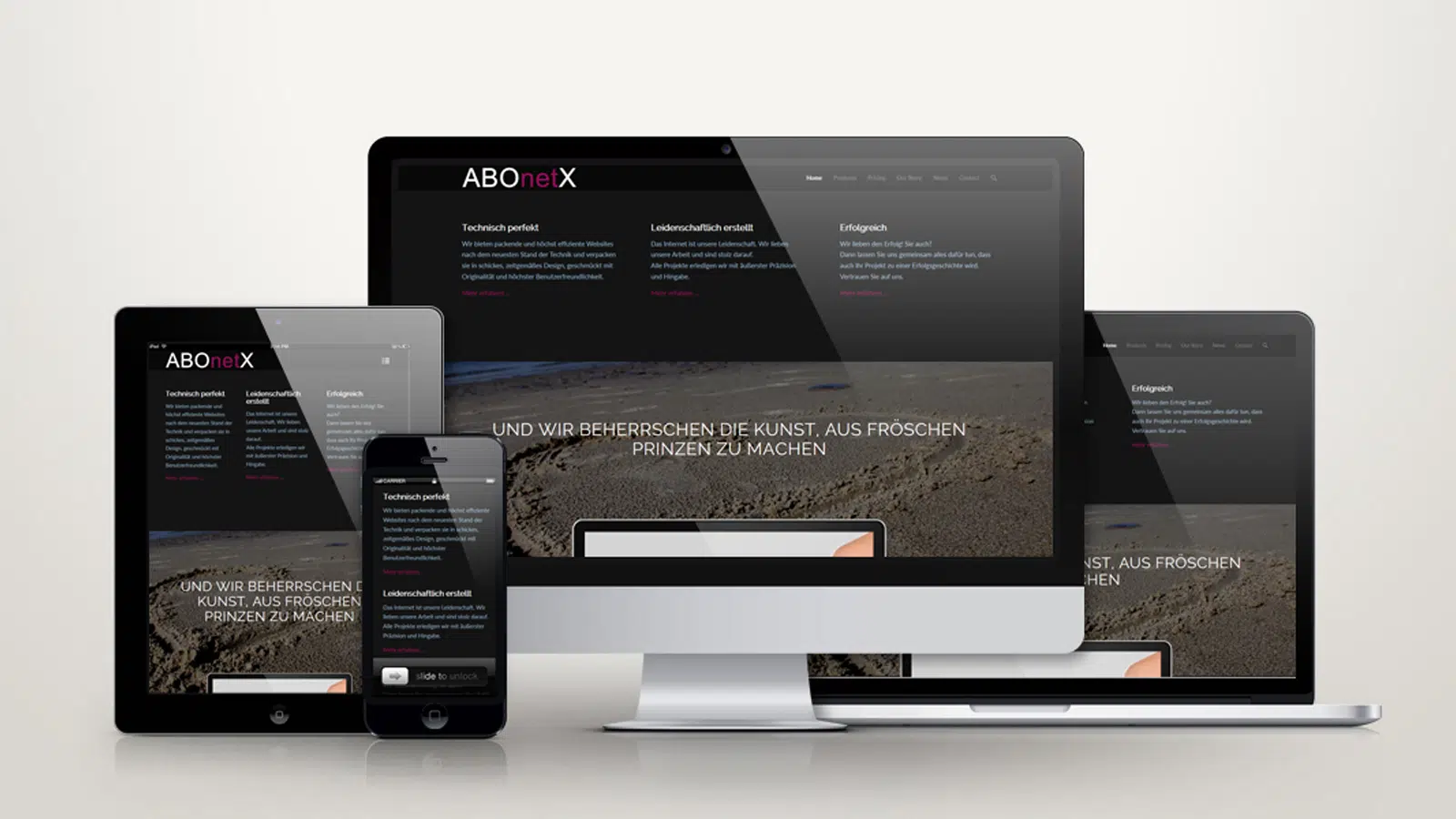
The term "responsive" means something like "able to react" and in fact a "responsive" website reacts flexibly to the size of the browser window of the respective device by adapting to its size. The basis of a Responsive Web Design is a so-called "liquid grid" in which the width of a page is defined by relative values and can thus change in relation to the size of the browser window.
When creating such a website, the designer must ensure that the navigation elements, screen layouts, texts, images, audio and video players and other elements adapt and adjust their size and arrangement depending on the end device.
Although this means a certain amount of additional expenditure in terms of time and money, it is far superior in terms of cost to the alternative of developing a separate design for each device and keeping it up to date during later operation.
Why is Responsive Web Design useful for your site?
First of all, the behavior of internet users has changed more and more in recent years. Recent research has shown that a majority of internet users worldwide use their smartphones as their main means of accessing the internet.
Last year, almost a third of the female respondents aged between 16 and 24 used the internet mainly with their smartphones. This is an important reason why you as a website owner should follow these latest marketing trends in order to attract new customers and not lose old ones.
Another very important aspect is that Google has pointed out in a wide variety of sources that it will give preference to websites for mobile devices in the future and want to value responsive design as a plus in the ranking factor.
Have we piqued your interest?
Then contact us. We would be happy to advise you without obligation.